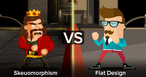
Ever since Apple released iOS 7 on September 18, 2013 there has been an ongoing conversation about the advantages and disadvantages of Skeuomorphism vs Flat Design. The irony to Apple’s introduction of flat design in 2013 is that Microsoft had already been doing this since 2010 when they released Windows Phone 7. Before Microsoft’s introduction to Metro design, mobile users had been accustomed to the more elaborate and overused ornamental design from the original iPhone in 2007.
Skeuomorphism… What?
In 2007 the user adaptivity to mobile interfaces was still evolving as they transitioned from actual buttons to touchscreens. So how did Apple overcome this challenge? By taking a step back into the history of marketing, Apple pioneered an ornamental design that was not only new and shiny, but also familiar and realistic. Apple understood design and general user behavior, where form once followed function had now evolved to following psychology. So to ease users into adapting to their mobile device, they used skeuomorphic designs in their software. This mitigated the learning curve of the iPhone and quickly increased adaptivity by emulating familiar experiences.
Skeuomorphism is such an obscure buzz word, that most people do not even acknowledge its existence. They would prefer to call it realism, which is a more commonly used term for this style of design. I can vouch for this, because I was once one of those people until I experienced this great analogy by Neven Mrgan. He really puts this term into perspective when he talks about the overdesigned components of classic cars to better attract consumers. Apple hit this logic right on the button with their intuitive experience and sheen appeal.
Advantages Of Skeuomorphism:
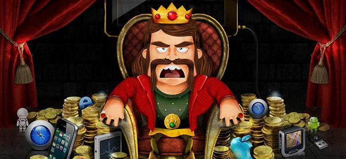
- Skeuomorphism is intuitive because of its attention to detail and familiarity to objects in the real world. From the calculator to the clock, these components are all digital illustrations created to mimic their real-world counterparts.
- Skeuomorphism is compelling and over embellished. It’s ornamental design makes any component attractive to the eye and more polished in its presentation.
From 2007 to 2011, Skeuomorphic design reigned as the standard even though Microsoft was gaining steam with their introduction of Metro design in 2010. By the end of 2012, people had taken note of this flat design phenomenon and were ready for something different, clear, and in depth. For every action there was a reaction, and in the world of digital design, flat imagery was cropping up more in favor as a reaction against skeuomorphism. Flat design was more than just an artistic treatment; it was a response to some serious functionality issues that skeuomorphism presented.
Disadvantages Of Skeuomorphism:
- Applying standards that are irrelevant in the digital format, Skeuomorphism can limit creativity and functionality. When done right, skeuomorphism will trigger strong associations with real-world counterparts. This is both a strength and a weakness: sometimes, the association can be so strong that it will stop us from improving on what’s already been done.
- Skeuomorphic elements can appear inconsistent when combined with less dimensional elements and often makes no logical sense. Example: Apple’s late Find My Friends app has a background that appears as if it was stitched leather, but this element has no relevance the functionality of the app.
- Skeuomorphic elements can take up valuable screen real estate and also rely heavily on images. This can increase the weight of the app sacrificing its performance for functionless embellishments.
- Over usage of Skeuomorphism can also overwhelm users by giving them too much eye candy at once. Simple is better in design, and less is actually a lot more in this case.
Make Way For Flat Design
Flat design was the response to embrace the true limitations that the digital world presented. In doing so, this design methodology overcame the imposed limitations that skeuomorphism had. Anything displaying on a screen would never truly look three dimensional, so why not embrace its beauty and increase its functionality concurrently? The advantages that came from stripping away illusory decoration was astonishing.
The beauty of flat design is not only in its minimalist presentation, but in its origins and where it derived from to date. Early practices of the style trace all the way back to 1919, The Bauhaus Movement. Shortly after the Bauhaus Movement was established, it spawned another style called Swiss Design. This style of design is also known as the International Style because of its adaptation that emerged in Russia, Germany and the Netherlands during the Roaring 20’s.
It was logical that the same elements and principles that worked in print would one day be experienced in digital world. Technology just had some catching up to do. This was not a problem for Apple, because this ideology was already established in the print design era. So what took the Swiss and the Germans generations to establish, only took Apple 6 years to accomplish. 2007 to 2013 was how long it took for Tech to firmly grip the stake in design. What can I say? Technology moves fast! So what are the advantages of Flat Design?
Advantages Of Flat Design:
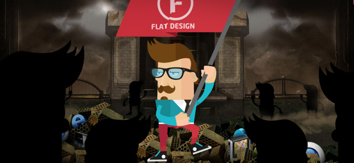
- Flat design is clear and to the point.
- Flat design is also simple and easy to use when properly executed.
- Flat design is modern in its appearance, which makes it more captivating.
- Flat design is efficient, responsive web design.
- Flat design is lightweight making it fast and performant for load times.
While all these advantages are great, we all know that with every advantage there’s sure to be a disadvantage. Flat design is no exception, let’s take a look below to see what those are.
Disadvantages Of Flat Design:
- Flat design is different from what people are used to.
- Flat design is difficult to execute well.
- Flat design can also be unclear on what’s clickable and what’s not when overused to the point of extreme minimalism.
- Flat design can be boring to the untrained eye.
- Flat design can also lack of personality.
So Where Are We Today?
Three years later after the launch of iOS 7 we find ourselves over using the flat design aesthetic to the point of tarnishing our UX. Some of the more obvious elements we used to emphasize a year ago are now being skewed to the point of no return. The issue here is extreme minimalism. Breaking something down is supposed to amplify its essence, not eliminate it entirely.

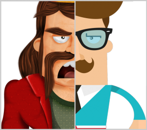
Trends come and go, then they come back again slightly evolved from their previous generation. Both styles of design have their advantages and disadvantages. One of the most recent trends I’ve noticed is a fusion of the two styles. Skeuomorphism and Flat Design with a minimalist feel, are paving new standards for the future design. Some of my favorite sites practicing these styles are Stripe, Gitter and Huge. Great design doesn’t come from any style, it comes from the fundamentals that have been set before us so we can properly execute, and continue to evolve new solutions. Thank you for reading my post and a very special thanks to Intacto for coming up with these creative illustrations to convey this topic! Join me next week for “My Top UI/UX Prototyping Tools for 2016” Good Bye.
- Pingback: Skeuomorphism vs. Flat Design – Internet and Tecnnology Answers for Geeks()
-
http://architect4wp.com Chris Howard
-
Jesus Enriquez
-
-
Dennis Lembrée
-
Jesus Enriquez
-
-
Daniëlle Zana